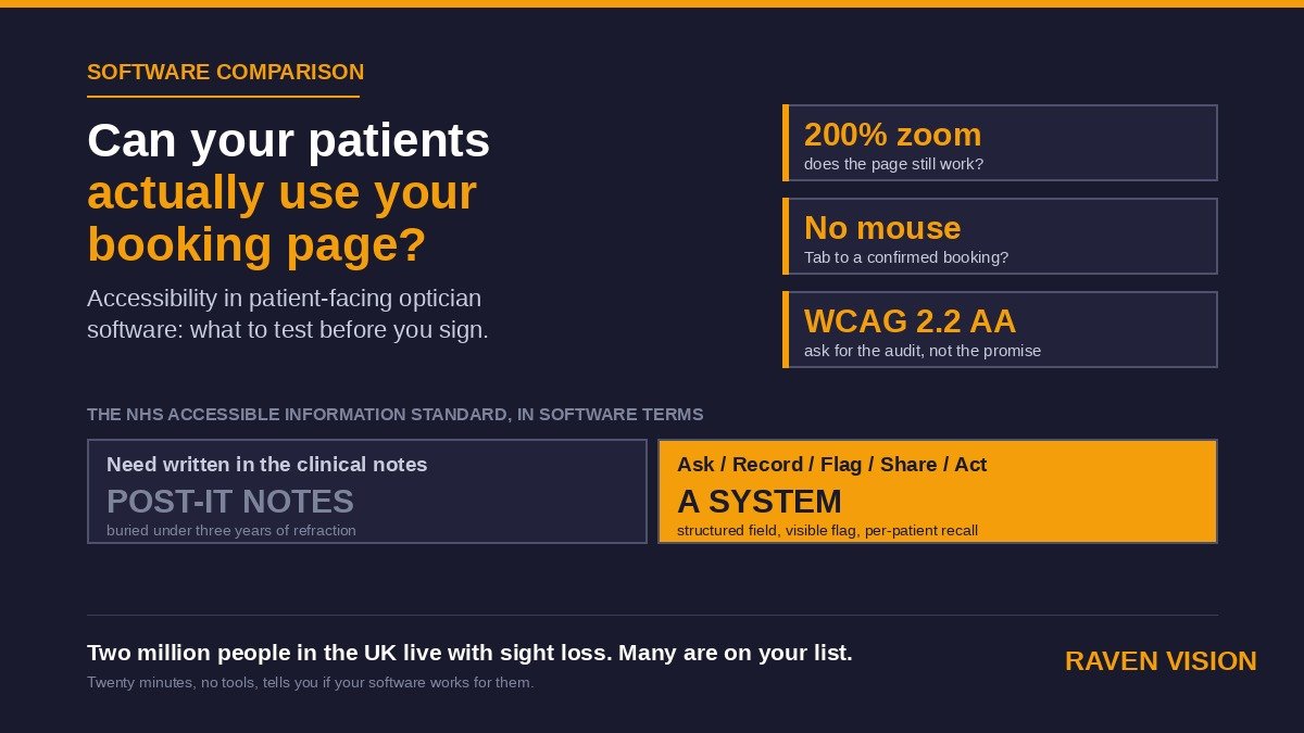

Here’s an awkward question for anyone selling software to opticians. Your patient list has more people with sight loss in it than almost any other business on the high street. So can they actually use the booking page you’ve put in front of them?
Most practice owners have never asked. They picked a practice management system on price, on the eGOS module, on whether the diary looked sensible. Fair enough. But every one of those systems now comes with patient-facing surfaces too: an online booking widget, a portal, pre-appointment forms, SMS and email recalls, maybe a tablet at reception. And the person on the other end of those surfaces is, by the nature of the job, more likely than average to be reading with a magnifier, a screen reader, a tremor, or a 40-year-old prescription that’s three years out of date.
This post is about how to compare optician practice management software on accessibility. Not in an abstract, box-ticking way. In a “can Mrs Patel, who has wet AMD and a Samsung phone, book her own appointment at 9pm on a Tuesday” way.
Why accessibility is a bigger deal for opticians than for the dentist next door
Start with who’s on the list. RNIB puts the number of people in the UK living with sight loss at over two million, and that figure climbs steeply with age. Your 60-plus cohort, the one on NHS-funded sight tests, is exactly the group most likely to struggle with a small grey font on a white background or a “tap here” button the size of a grain of rice.
Then add the rest: patients with dementia, learning disabilities, hearing loss, arthritis in the hands, dyslexia, or just a cracked phone screen. We’ve written before about low vision services and eye care for patients with dementia. Both posts came back to the same point. The clinical care in the room is usually fine. It’s everything around the room, the booking, the reminders, the forms, that quietly excludes people.
And there’s a compliance angle you can’t wave away. If you hold a GOS contract in England, the NHS Accessible Information Standard applies to you. It has since 2016. FODO and the Optical Confederation published specific guidance for community optical practices on it. The Standard asks you to do five things: ask patients about their information and communication needs, record them, flag them so they’re visible whenever the record is opened, share them on referral, and act on them. Underneath that sits the Equality Act 2010 and its duty to make reasonable adjustments.
Read those five verbs again. Ask. Record. Flag. Share. Act. Four of the five are software features. If your PMS can’t record a communication need in a structured field and throw it in the clinician’s face when the record opens, you’re doing the Standard on Post-it notes.
Two different questions hiding inside “is it accessible?”
When you compare systems, keep two things separate, because vendors love to blur them.
1. Can patients with access needs use the patient-facing bits?
This is the booking widget on your website, the patient portal, online forms, the confirmation and recall messages, and any check-in screen in practice. It’s what people usually mean by “accessible software,” and it’s the part most vendors have never tested with a real screen reader.
2. Does the system help your team meet the needs of patients who walk in?
This is the Accessible Information Standard side. Structured fields for communication needs. Flags. Large-print letter templates. The ability to send a recall by phone call instead of SMS because the patient has told you they can’t read texts. This is a patient records question, and it’s the half that quietly matters more for a GOS practice.
A system can be brilliant at one and useless at the other. Ask about both.
The standard you should be asking about: WCAG 2.2
You don’t need to become a web accessibility expert. You need one acronym. The Web Content Accessibility Guidelines, WCAG, are the international benchmark that UK public sector websites are legally required to meet, and the thing any serious software vendor will benchmark against. Version 2.2 landed in October 2023 and is the current one.
Conformance comes in levels: A, AA and AAA. AA is the realistic target, and it’s what public bodies in the UK are held to. If a vendor says their patient-facing pages are “accessible,” ask them a plain question: “Do they meet WCAG 2.2 AA, and can you show me the audit?” The answer you get tells you most of what you need to know. A vendor who has done the work will send you a document. A vendor who hasn’t will tell you it’s “on the roadmap.”
A few of the 2.2 additions are worth knowing because they hit opticians’ patients directly. Target size: interactive elements now need a minimum of 24 by 24 CSS pixels so people with tremor or reduced dexterity can hit them. Redundant entry: a form shouldn’t make someone type the same information twice in one process, which is a gift to anyone with a learning disability or who’s simply typing with one eye covered. Accessible authentication: no cognitive-function tests like remembering a password with no alternative, or solving a puzzle, just to log in. Focus visibility: a keyboard user should always be able to see where they are on the page.
What to actually test on the booking widget
Get a demo login or, better, ask for the URL of a live practice’s booking page. Then spend twenty minutes doing this. You don’t need any tools you don’t already own.
Zoom it to 200%
Hold Ctrl (or Cmd) and press plus a few times until the browser is at 200%. Does the page still work, or do buttons disappear off the edge and text overlap? A patient with moderate sight loss lives at 200% and above. WCAG requires content to reflow rather than force sideways scrolling at that level.
Put the mouse down
Use only Tab, Shift+Tab, Enter and the arrow keys. Can you get from the top of the page to a confirmed appointment? Is it always obvious which element is highlighted? If the focus vanishes into a date-picker and never comes out, a screen reader user is stuck there too.
Turn on the screen reader you already have
Every iPhone has VoiceOver. Every Android phone has TalkBack. Windows has Narrator built in. Switch it on and try to book an appointment on your phone with your eyes shut. This is the single most revealing test you can do, and almost nobody selling optician software has done it on their own product. Listen for the calendar. Does it read out dates, or does it say “button, button, button”?
Check the colours
Pale grey text on white fails contrast requirements and it’s everywhere in modern software design. AA needs a 4.5:1 ratio for normal text. There are free contrast checkers online; paste in the two colours from the widget and see. Also check that nothing is conveyed by colour alone. A red-only “unavailable” slot with no text or pattern is invisible to a patient with colour vision deficiency, which for men is about one in twelve.
Try it on a bad phone in bright light
Sounds silly. It isn’t. Your older patients are not on the latest handset. The widget needs to work on a five-year-old Android with a cracked screen in a bus shelter. We compared systems on this in our mobile and tablet access post, and the gap between vendors was wide.
Time limits and error messages
Does the booking session time out after five minutes with no warning? Does an error say “Invalid input” in red, or does it say “Please enter your date of birth as DD/MM/YYYY” next to the field that’s wrong? The second is an accessibility feature. The first is a phone call to your front desk.
The records side: does the PMS let you do the Standard?
This is where independent practices in England should be strictest, because it’s the half with a contract behind it. Walk through the five steps with the vendor and ask to see each one on screen.
Ask
Do the new patient forms, online and in practice, have a proper question about communication and information needs? Not a free-text “any other information” box. A structured question with options: large print, easy read, BSL interpreter, needs a carer present, prefers phone over text, and so on. If the patient portal and online forms module is capturing this before the visit, you’re ahead before the patient arrives.
Record
Where does the answer go? It should land in a dedicated field on the patient record, not in the clinical notes where it gets buried under three years of refraction. Structured means reportable, which means you can run a list of every patient who needs a large-print recall.
Flag
The Standard says the need has to be “highly visible” whenever the record is accessed. In software terms that’s a banner or alert on the record header and, ideally, on the diary entry too, so the receptionist booking the slot knows to allow extra time or book the interpreter. Ask to see it. If the flag is a small icon in a tab nobody opens, it’s not a flag.
Share
When you refer to the hospital eye service, does the referral letter carry the communication need automatically? It should. Retyping it is how it gets missed.
Act
This is the one that separates systems. Can you set a recall preference per patient, so the recall engine sends a phone task instead of an SMS? Can you print a large-print version of the appointment letter from a template rather than fiddling with font sizes in Word? Can the reception team see, at a glance, that the next patient prefers to be spoken to face-on because they lip-read? Our recall system is built around per-patient channel preferences for exactly this reason. A recall that goes out on a channel the patient can’t use isn’t a recall. It’s a missed appointment waiting to happen.
Comparing vendors: the questions that get honest answers
Put these in an email before the demo so they can’t be improvised around.
Have your patient-facing pages been audited against WCAG 2.2 AA, and can we see the report? When was it done, and by whom? Do you have an accessibility statement we can link to from our website? Which screen readers and browsers have you tested the booking widget with? Can the booking widget be used entirely by keyboard? Does the system have a structured communication-needs field, a visible flag on the record, and per-patient recall channel preferences? Can we export a list of patients by communication need? What happens to accessibility when we customise the widget’s colours to match our branding, and will you warn us if we pick a combination that fails contrast?
That last one catches people out. Plenty of practices have taken a perfectly accessible widget and made it unusable by changing the button colour to match the shopfront.
If you’re going through a wider selection exercise, this sits alongside the questions we set out in online booking and self-scheduling software and the bigger switching checklist. Accessibility shouldn’t be its own tick-box column. It’s a lens on every other feature.
What good looks like in a small practice, without a project plan
You don’t need a consultant. A two-partner practice can get most of the way there in an afternoon.
Run the twenty-minute test above on your own booking page and write down what breaks. Send that list to your vendor and ask when it’ll be fixed. Add the communication-needs question to your new patient form this week, online and paper. Go through your existing list and flag the patients you already know about: the ones whose daughter always phones, the ones who ask for the big-print letter. Set their recall channel accordingly. Put a one-paragraph accessibility statement on your website saying what your booking page does and doesn’t support and giving a phone number for anyone who’d rather book by voice.
Then do the thing that no software can do for you: tell your team. The best system in the world is beaten by a receptionist who doesn’t know why there’s a flag on the record.
Where Raven Vision sits on this
Honest answer, since that’s the whole tone of this post. Raven Vision was built by Shaukat, an optometrist with 35 years of practice behind him, inside his own three practices, for patients who were largely over 60. So the pressure to make the patient-facing side usable by people with poor vision was there from day one; it wasn’t a compliance afterthought. The booking widget we embed on practices’ websites gets used by exactly that patient base every week, and we’d rather you run the twenty-minute test on it yourself than take our word for anything. On the records side, patient alerts and notes on the patient record show when the record is opened, recall channel and timing are set per patient, and the appointment diary is built for the receptionist who needs to see what’s coming before the patient walks in.
We’re not going to claim a formal WCAG 2.2 AA certificate; if you ask us that question in the email above, you’ll get a straight answer about where we are and where we’re not. Which, as it happens, is the answer you should be looking for from any vendor.
The commercials are simple. £149 a month per practice, three months free, no setup fee, free data migration and a 30-day money-back guarantee, plus a free website with the booking widget built in if you haven’t got one. You can see the current offer or the full pricing breakdown, and if you want to run the twenty-minute test on our booking page before you speak to anyone, we’d encourage it.
Because if there’s one profession that should insist its software works for people who can’t see well, it’s yours.